
August 30, 2026
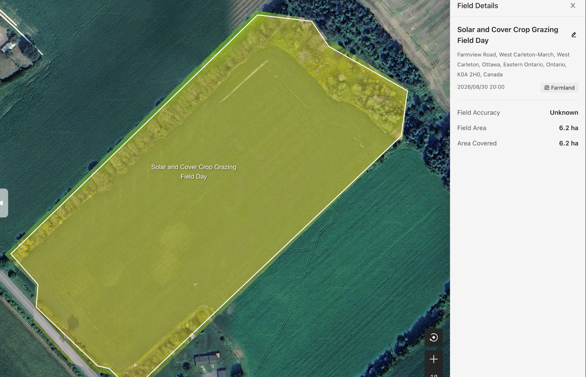
At the Solar and Cover Crop Grazing Field Day in Arnprior and Kinburn, we used a drone to capture multi-spectral imagery of a soybean field.
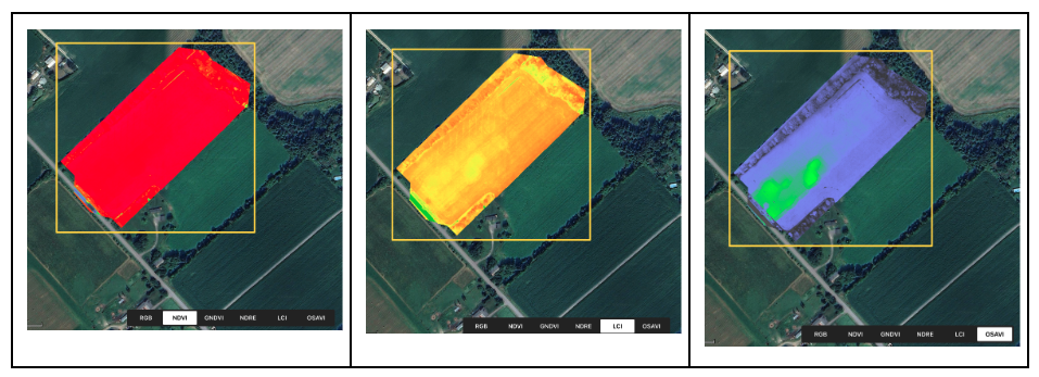
Along with standard RGB aerial imagery, we collected several vegetation indices, including NDVI, GNDVI, NDRE, LCI, and OSAVI, as well as an elevation map of the field.
When people first see all these colorful maps, one of the most common questions is:
What are these colors actually telling us?
It doesn’t have to be complicated.
For growers, one of the most practical questions multi-spectral imagery can help answer is:
In a field this large, if crops are under stress—or simply growing differently from the surrounding area—can we find those spots faster?
That’s where this technology can be especially useful.
This Time, We Found Something Interesting
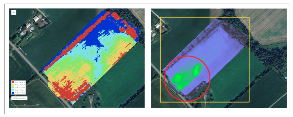
In the OSAVI imagery from this soybean field, one area stood out with a noticeably bright green response.
The first thought might naturally be:
“Are the soybeans growing especially well here?”
That’s a reasonable hypothesis, but we didn’t want to jump to that conclusion.
One important principle when working with multi-spectral imagery is:
Color can tell us that an area is different, but color alone cannot tell us why it is different.
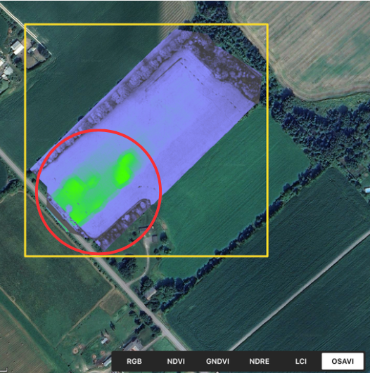
The OSAVI image shows a bright green area that stands out from its surroundings. So, what might be different here?
We then looked at the same location using RGB, NDRE, LCI, and other layers.
There were indeed some differences worth investigating.
Then we opened the field’s elevation map.
That’s when things became even more interesting.
Could This Area Be “Not Too Dry, Not Too Wet”?
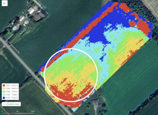
The elevation map shows that this field isn’t perfectly flat. There are noticeable changes in elevation across it.
Interestingly, the area we were looking at appears to sit roughly within a transition zone between higher and lower ground.
That leads to an interesting hypothesis:
Could this area be sitting in a “sweet spot”—not too dry and not too wet?
Lower areas of a field may be more likely to collect water after rainfall. Higher ground generally drains faster, but during dry periods it may also lose available moisture sooner.
An area between the two may sometimes offer a better balance:
Good drainage, while still retaining enough soil moisture.
For soybeans, we can think about the relationship like this:
Favorable landscape position → better balance between drainage and moisture retention → suitable soil moisture → more stable root environment → more consistent water and nutrient uptake → potentially better crop performance
When we look at the OSAVI and elevation maps together, we now have a hypothesis worth testing:
The different soybean response in this area may be related to its landscape position and the soil moisture conditions associated with that position.
But Green Does Not Automatically Mean “Best”
This is important.
From an agronomic perspective, the explanation above is a reasonable hypothesis, but it is not yet a final conclusion.
Many factors can influence multi-spectral imagery.
Soil moisture, soil properties, fertility, weeds, pests, and disease can all create differences in spectral response. Lighting conditions, image stitching, calibration, and data processing can also affect how the final map appears.
In this particular OSAVI image, some of the bright green areas also have relatively regular, block-like boundaries. That means we shouldn’t completely rule out the possibility that image acquisition or processing may be exaggerating part of the difference.
A more accurate way to describe what we see is:
There may be a real difference in terrain, soil moisture, and crop performance in this area—but we still need to ground-truth it to understand what is actually happening.
The Drone Doesn’t Make the Final Diagnosis—It Tells Us Where to Look First
Imagine scouting a field that covers several hundred acres.
Finding a problem through conventional scouting could take hours.
With aerial imagery, we can first scan the entire field, identify areas that stand out, and then go directly to those locations for closer inspection.
Instead of:
“Let’s walk the field and try to find the problem.”
We can move toward:
“We already know where something looks different. Let’s go there and find out why.”
That is where drones can potentially save growers a significant amount of time.
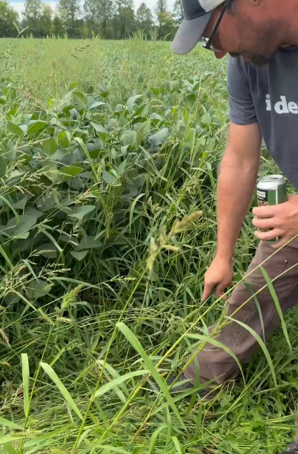
The Next Step Is Simple: Go Look at the Crop
For the bright green area identified in this field, we could select several sampling points:
the center of the green area, its edge, a nearby normal-looking area, and locations at different elevations.
Then we can compare what is actually happening on the ground.
Are the soybeans taller?
Are the leaves darker green?
Is the canopy denser?
Are there differences in pod set?
Is the soil wetter or drier?
If the soybeans in the highlighted area are indeed performing better and the soil moisture is also more favorable, then we have stronger evidence supporting the relationship:
Landscape position → soil moisture → root environment → crop performance
And if we go to the field and find very little difference?
That’s valuable information too.
It tells us to investigate other possibilities, including lighting, imagery, processing, or other factors, rather than making a management decision based on color alone.
Looking Beyond the Image
After harvest, there’s one more piece of information we’d love to see: the yield map.
The multi-spectral imagery shows us where the crop is responding differently today. The yield map can help us look back and ask a simple question:
Did the differences we saw during the growing season actually translate into differences in yield?
That comparison can give us another piece of the story—but ultimately, every field is different. That’s why we’d also love to hear from the growers who know this field best:
Does what we’re seeing from the air match what you’re actually seeing on the ground?
Over the past several years, we’ve been fortunate to help research organizations, universities, and growers across Canada adopt drone and multi-spectral technologies for agricultural research and field management.
And through that experience, one thing has become very clear to us:
The value isn’t in creating another colorful map. It’s in helping people see what matters sooner and make better-informed decisions in the field.
We hope these technologies can continue to make agricultural research and everyday field management a little faster, a little easier, and better informed.
Remote sensing gives us clues. The field gives us the answer.
WONDERFULL INC.
Transport Canada Recognized RPAS Flight School
Certified Advanced Flight Reviewer | Drone Compliance | Academy Training | Agricultural Drone Sales & Service
Office: 647-800-7952
Text/WhatsApp: 647-287-6851
5955 10 Sideroad, Innisfil, ON L0L 1K0, Canada